Brand Design // Packaging // Environmental
Wayward Artisan Ales
A friend of ours had been toying with the idea of opening a brewery for a couple of years, so when he expressed that he was ready for an identity system to be built out, we hopped at the chance. See what we did there?
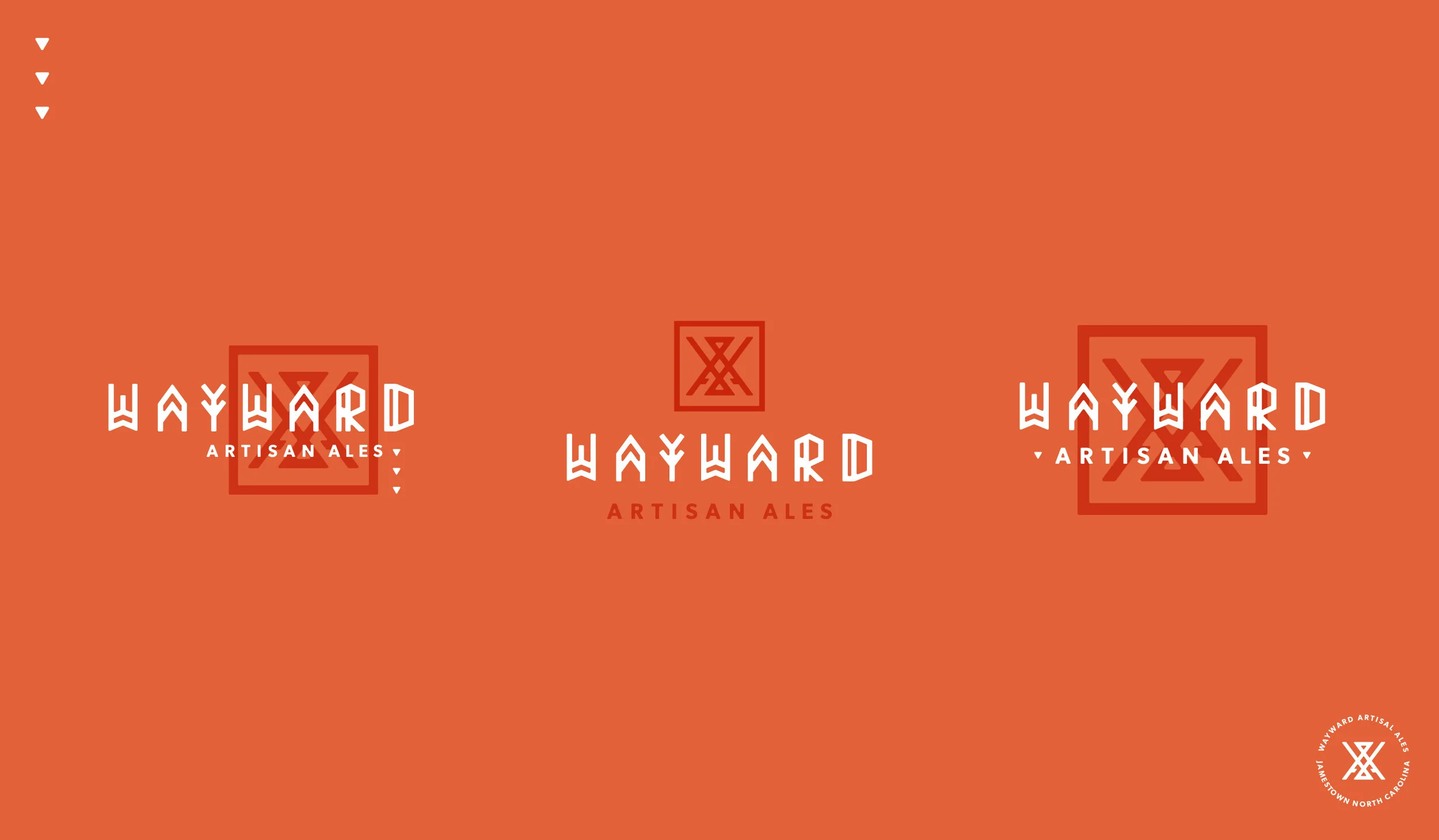
He already had a name in place that represented the need for adventure and cutting your own path in life, so we set out to develop an identity system that we affectionately came to label as tribal modernism. We began with a monogram which incorporates the “W,” and “A,” and also contains the image of a tee-pee to tie back to the nomadic tenet of the brand. We then married this mark with a custom-build logotype.
We rounded out his initial family of materials with letterpress-printed business cards, screen-printed bottling concepts, and brick-and-mortar elevation options.