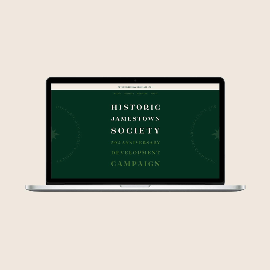
Campaign Identity
Historic Jamestown Society
Ever since our move, we’ve been trying our damndest to weave our creative thread into the quaint little town that we now live in and love. Luckily, we got the opportunity we were looking for earlier this year when The Historic Jamestown Society came to us in search of a visual identity for their upcoming anniversary and subsequent fundraising campaign. HJS’s paramount mission is the interpretation and preservation of the rich heritage of Jamestown and its surrounding communities by exploring, sharing, and documenting the significant stories, experiences, and material cultures of the past in order to promote tolerance, inspire peace, and highlight the necessity of education. We couldn’t have been more aligned with their core purpose, so we wasted no time in getting to talking about their goals for the upcoming campaign.
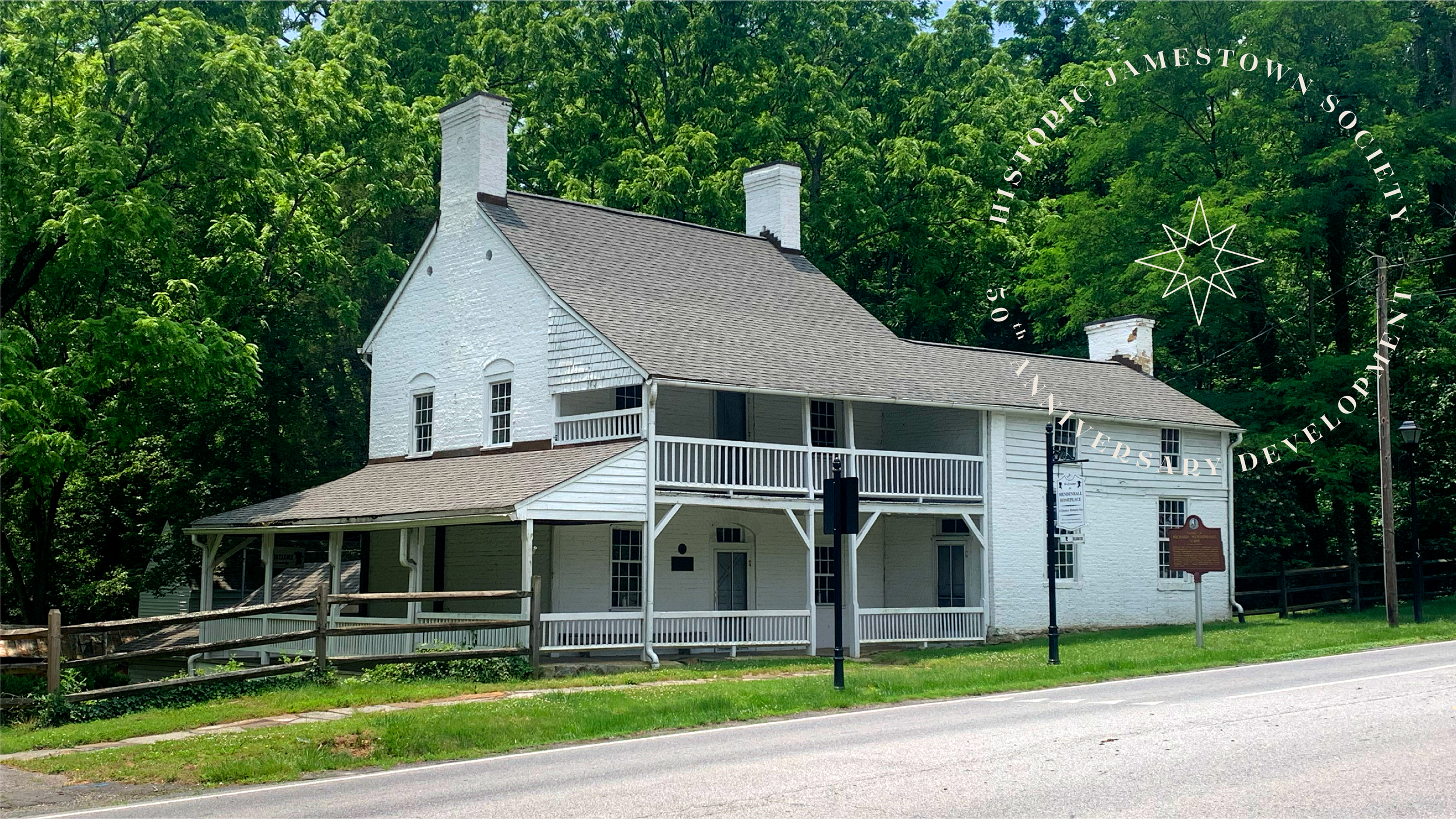
HJS’s primary property (and base of operations) is the Mendenhall Homeplace. Named after Richard Mendenhall, the site includes his former home (c. 1811), and other structures of historical significance including one of the state’s first medical schools and NC’s oldest Pennsylvania-style bank barn. History nerds unite.
With The Richard Mendenhall House serving as the organization’s spotlight attraction, it seemed only logical to lean into the structure as the identity’s foundational element. I mean, who wouldn’t want to take a stab at creating a modern interpretation of a 200+ year old architectural accomplishment? Not us.
The illustration is intentionally spartan to leave as much room for interpretation as possible, while including the elements needed to ensure the illustration is recognizable to all familiar with the area.

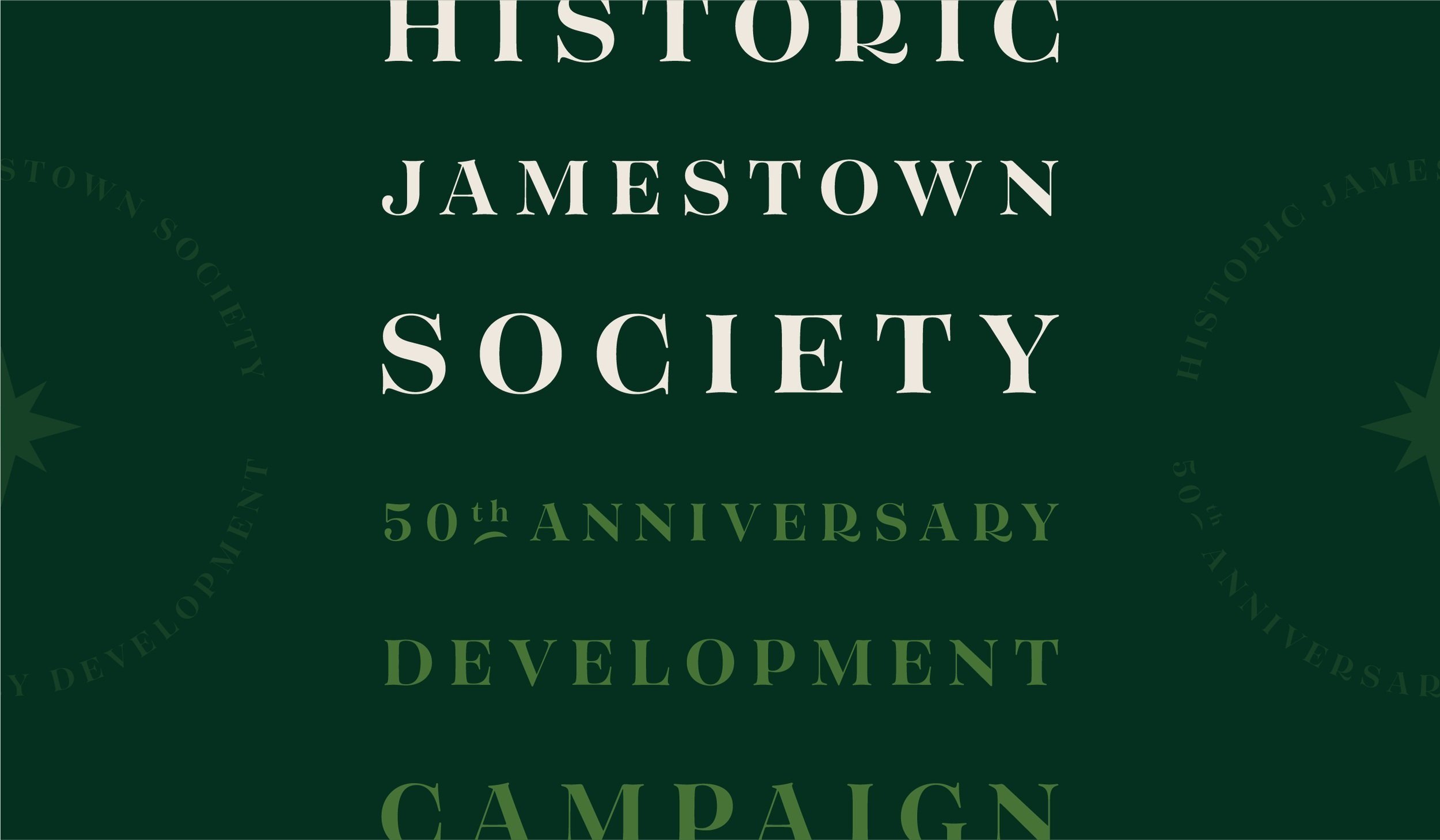
While developing the cornerstone illustration and letting its style guide the aesthetic and palette, we got to work building out the remainder of the system, employing an elegant serif face as the primary messenger. We leaned into the local heritage and history to inform the additional brand smashables.
The property’s historical registry signage, the wagon wheel (a nod to the false-bottom wagon the Quakers used to transport escaped slaves to safety), and a stylized representation of the Quaker star can all be found within the graphic vernacular.

We then took the final ID and applied it to a small but curated list of deliverables that we and the clients agreed would pack the most punch and maximize their ROI for this project, garnering as much attention to the upcoming fundraising campaign as possible.