Brand & Identity Development
Housing Collaborative
Housing Collaborative is a nonprofit organization with a long history of working with a large variety of people, groups and organizations to increase access to housing. They understand that navigating the process of procuring affordable housing can be extremely difficult for tenants and property providers alike, so they use their vast knowledge to simplify the process. They were running into some trouble gaining traction, and their current website was preventing them from presenting themselves as the legitimate nonprofit they are. The problem wasn’t what they were doing. Rather, it was that their brand and visual identity wasn’t accurately reflecting who they were and why they were doing it. At the time, they weren’t even known as Housing Collab — They were operating under the name Socialserve. That’s where we came in.

Before we could start brainstorming a new identity system, we got to work on a new name. “Socialserve” didn’t say much about who this group was or what they did. The name Housing Collaborative put their purpose front and center, and served as an ideal cornerstone for the accompanying strategy and brand.
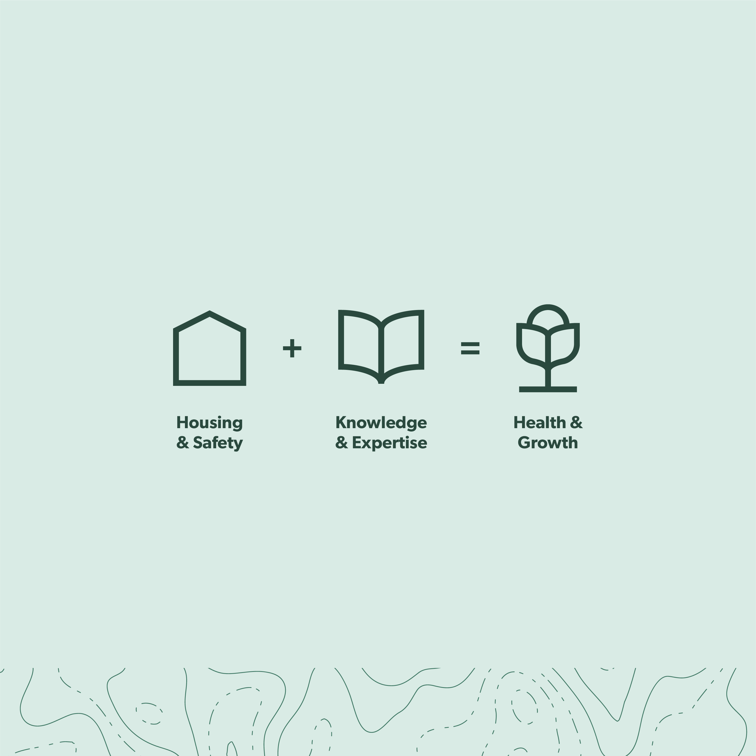
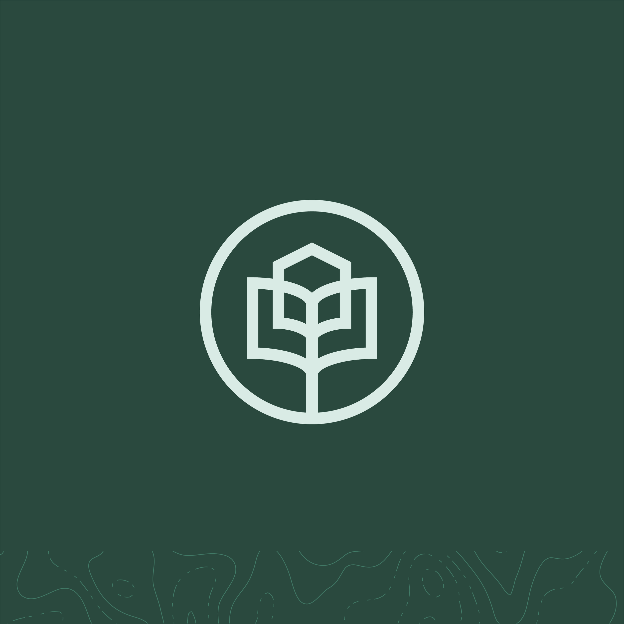
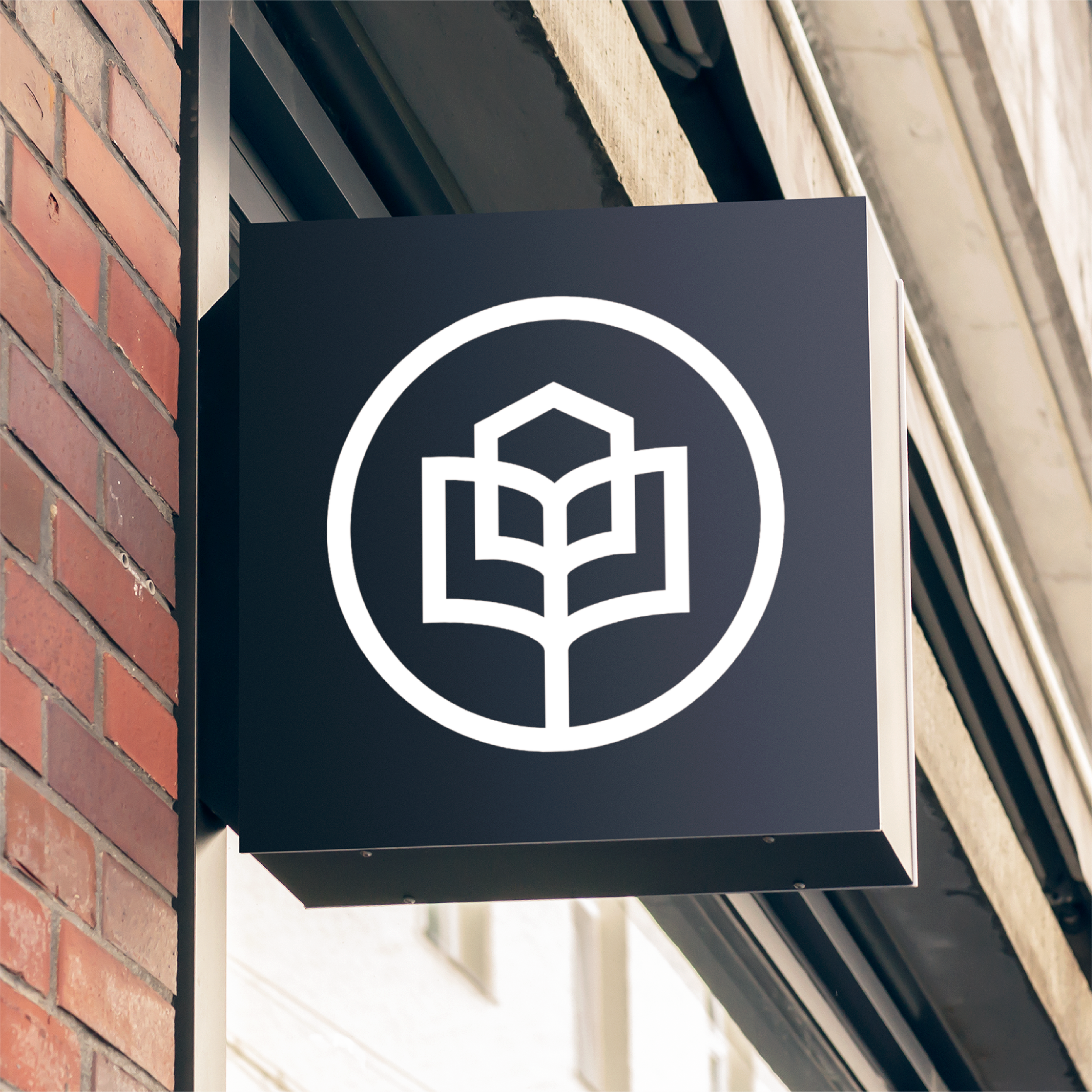
After establishing the palette best suited to accompany yet slightly disrupt their unique market, we turned to the organization’s vision for primary mark inspiration. We took a simple equation and turned it into a graphic amalgamation of three icons representing the what, the how and the end result. The finished product is simple, sleek and differentiating in Housing Collab’s space.
From there, we found a combination of typefaces to work with the new brand identity and communications. By using faces that are equal parts bold and humanist, we found something that was equal parts professional and welcoming.


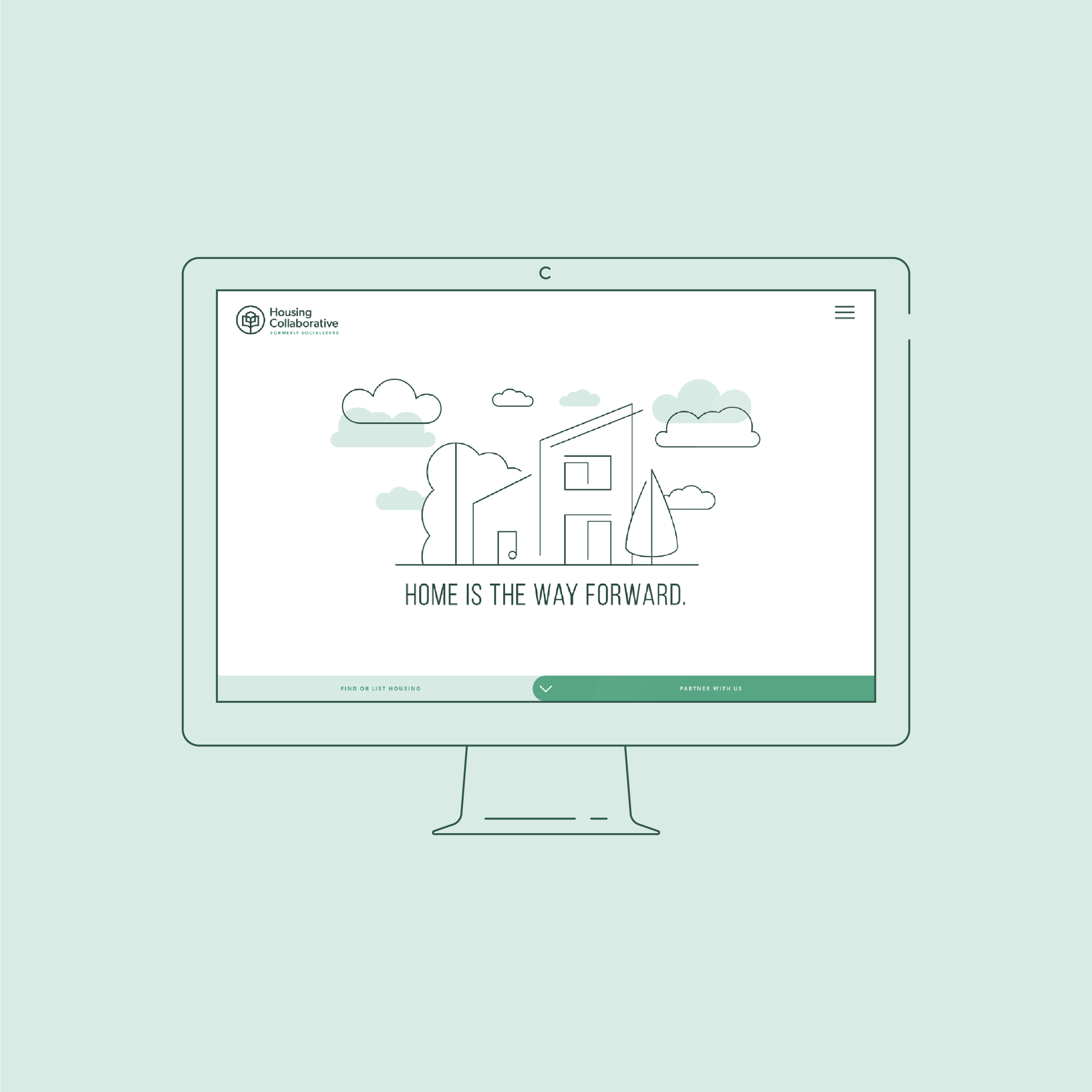
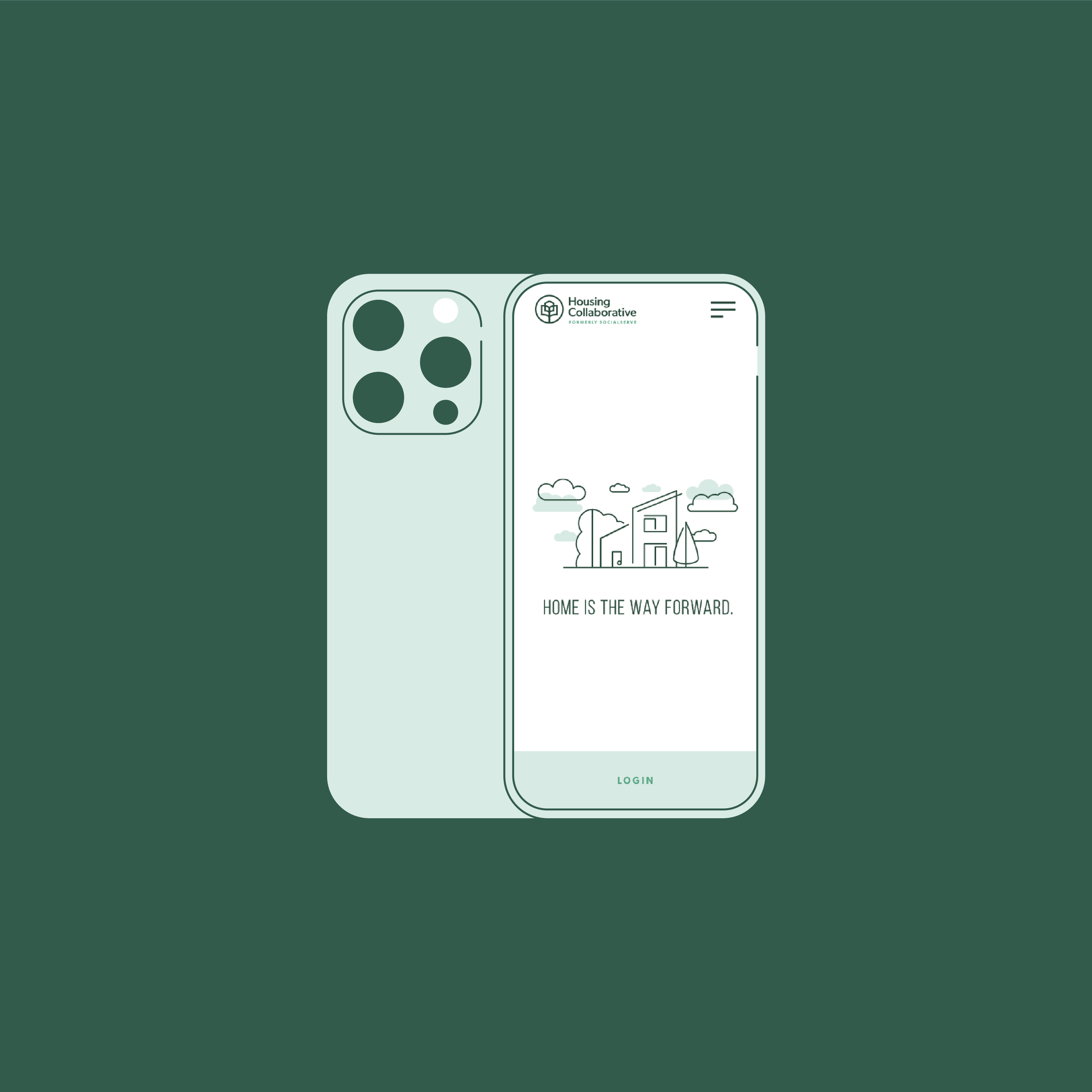
We knew we wanted Housing Collab’s new visual identity to features unique illustrations that can come together with speed. We settled on a line-driven style with subtle shades of green that offset just enough from the linework to add a touch of depth and contrast.


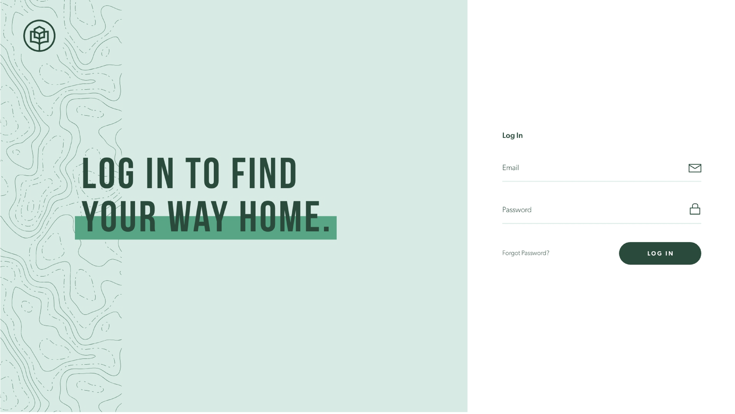
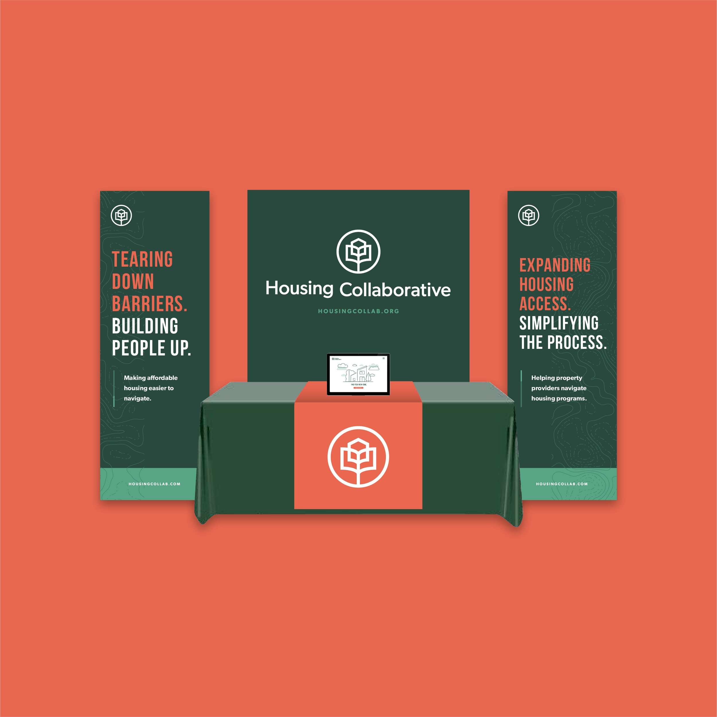
Once we had all the pieces in front of us, it was time to see how the puzzle fit together to make the brand communications truly shine. From print collateral to tchotchkes to digital, the greens with the occasional burst of coral really stand out in the housing-related nonprofit space, giving Housing Collaborative a leg up in all their communications and marketing materials.