Brand & Identity
Westerwood Tavern
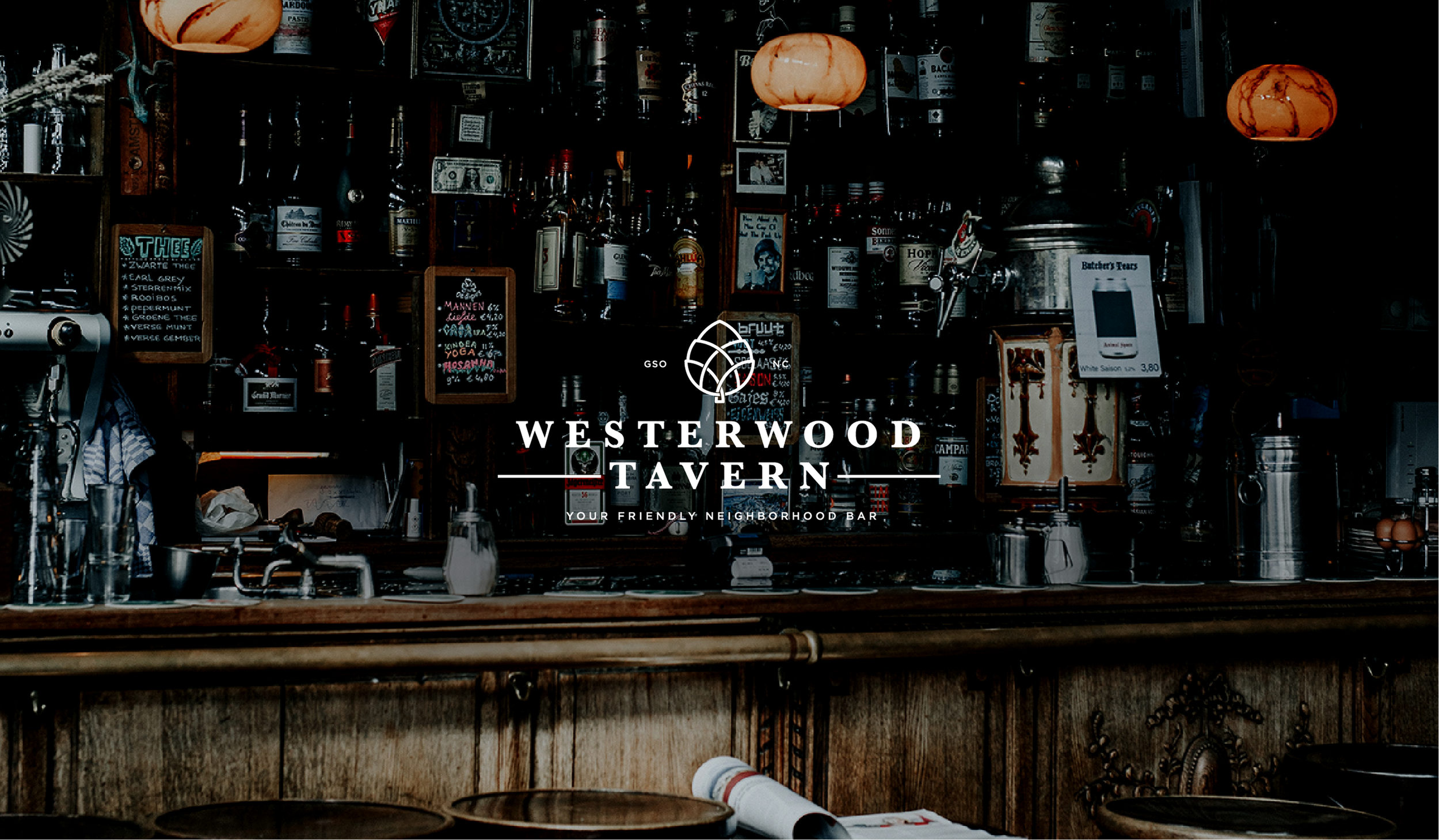
One of our favorite college haunts, Westerwood Tavern, reached out to us about a logo when they underwent new management. Being a neighborhood staple for decades meant that they wanted to honor the history of the place and its people, while giving it an updated and recognizable identity. The tavern is named after the neighborhood it sits in, Westerwood, which is one of the city’s oldest established subdivisions and sits just west of downtown. We took the notion of community to heart when designing the “braided hops” in the logo for Westerwood, symbolizing the thoroughfares in and out of the neighborhood that would take its citizens to nearby churches, synagogues, schools, universities, shops, and even the local watering hole.